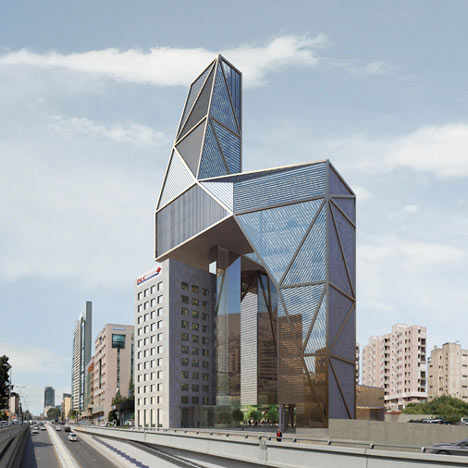
Lebanon architects Atelier Hapsitus’s proposed design for the new headquarters of the BLC bank in Beirut would cantilever over the existing building.
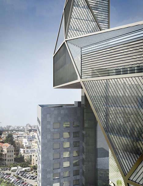
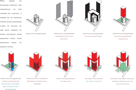
The existing BLC headquarters would be renovated and connect with the new building at basement level.
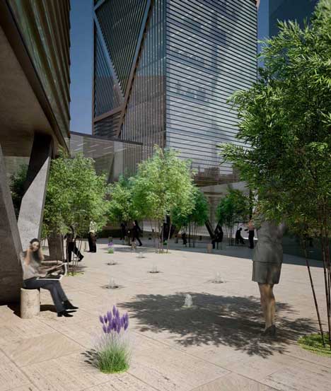
The gateway form of the new BLC headquarters would allow the existing building to retain its views and also eventually be removed.
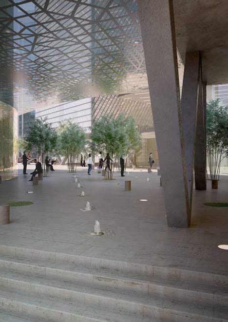
The new building is supported on columns at first-storey level to leave plenty of civic space underneath.
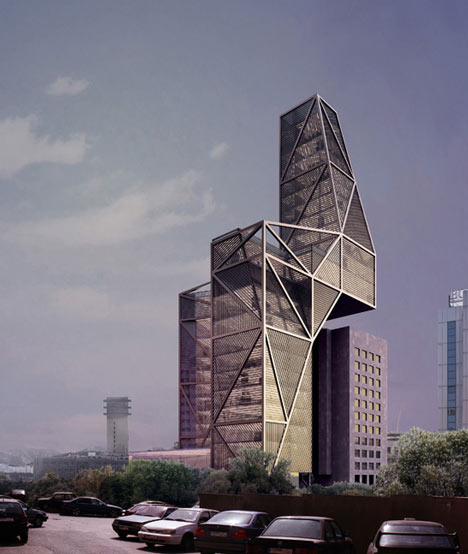
The design is one of two schemes shortlisted for a final competition to be decided in two months.
Here’s some more from the architects:
Selected as co-finalist
The project consists of the creation of a landmark for the city of Beirut, extending the existing building without destroying it. We created a project whereupon the new structure shares the corner with the existing building and cantilevers above it.
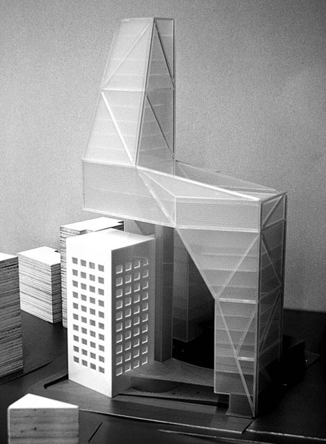
The presence of the existing building at the corner of the site was an enigma to us. It had the key position on the site, although it was not necessarily the most appropriate image for the BLC new headquarters.
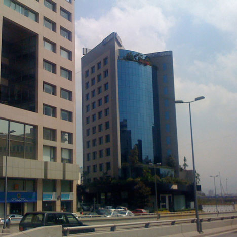
Above: The existing BLC building
In order to resolve this issue, we created a project whereupon the new structure shares the corner with the existing building and cantilevers above it. In this way, the different expressions of old and new become complementary, working together in symbiosis.
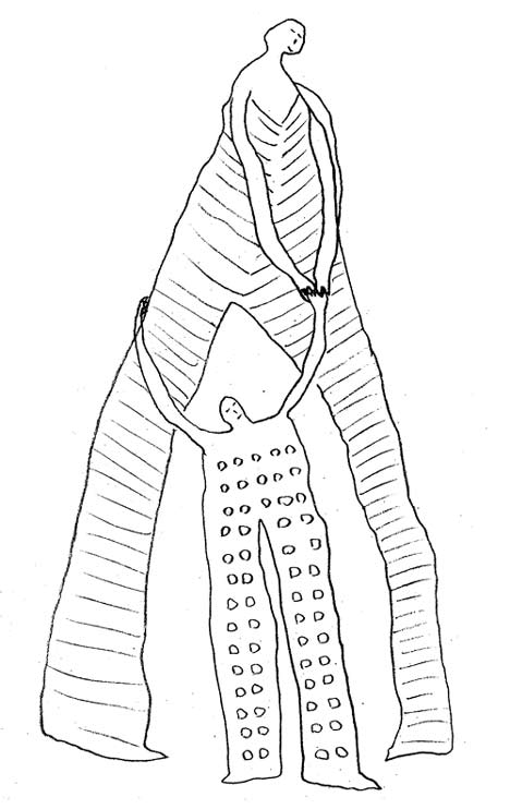
Our proposal for the BLC headquarters strives to reflect the history of the bank and project its future with a design strategy that responds intuitively to the site. Like the new administration of BLC, we have chosen to adopt the existing structure, streamline it, correct its dysfunctional aspects, and celebrate it as the departure point for a dynamic, sophisticated and unique composition growing around and above it.
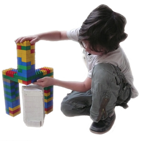
We believe that BLC Bank is best represented by a project that opens itself visually to the urban fabric with alluring spaces and landscape, rather than the hermetic and alienating facades that often characterize large corporations. The streetscape we have conceived gives the image of a bank which is progressive, has a civil consciousness and offers a quality environment to clients and employees alike.
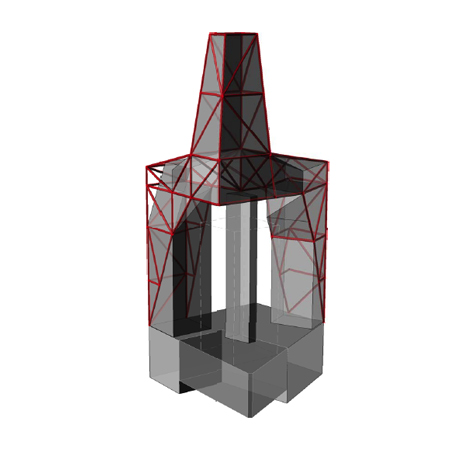
The design of the project is an unselfconscious gesture shaped by the site itself and the needs of the project. We toyed with forms and ideas until an intuitive, almost spontaneous shape imposed itself; a process which gives the design an edge of unconventionality.
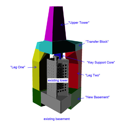
The total project is an arresting visible landmark that thrusts the bank headquarters into the 21st century in all ways possible. It is innovative in design, in its integration of the existing building, in the way it addresses the site, in its use of sustainability, in forward-thinking social facilities, and in its bold structural solution which makes the design possible.
Consultants:
ARUP London for structural studies.
ZEF London for sustainability and low energy studies.