Wednesday, 28 April 2021
Sunday, 3 April 2011
Distance of Fog by StudioGreenBlue
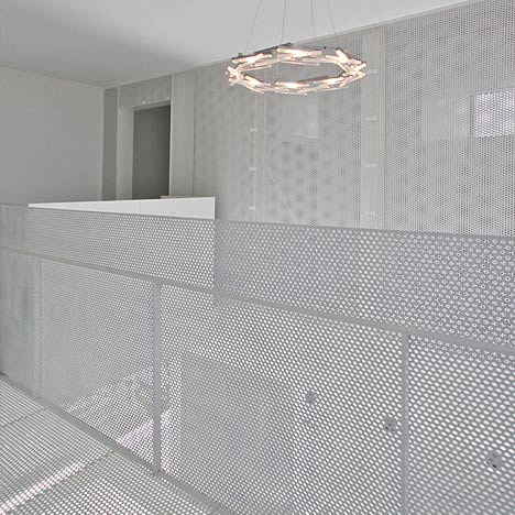
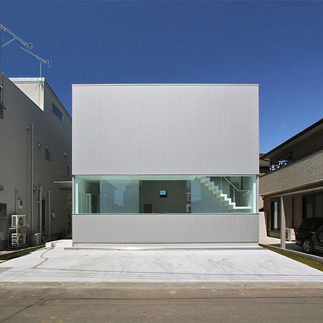
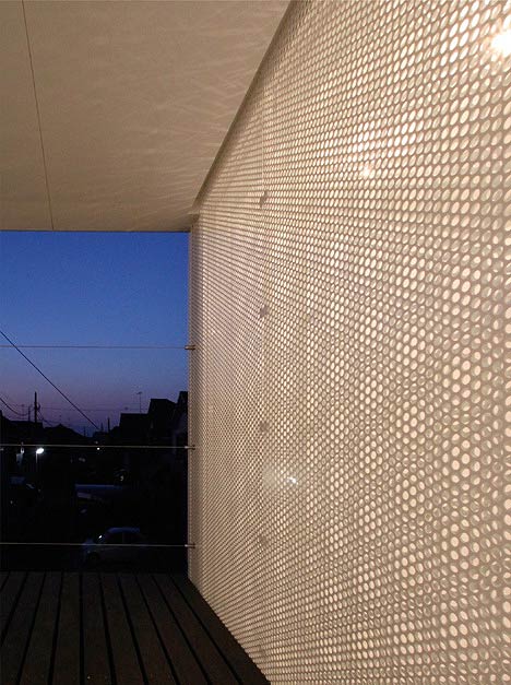
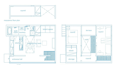
Japanese architects StudioGreenBlue have completed a house in Kōnosu City, Saitama Prefecuture, Japan, with an interior featuring white perforated screens throughout the space.
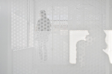
Called Distance of Fog, the project incorporates metal screens to provide sense of privacy within the open-plan space.
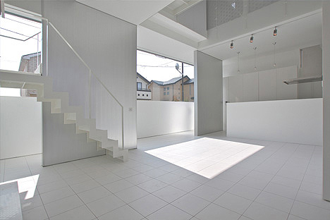
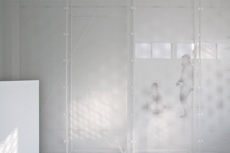
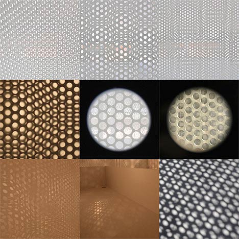
Th perforated partitions each have a different pattern and have been arranged to overlap each other.
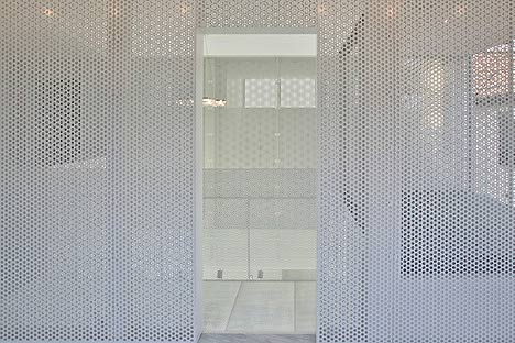
This overlapping creates a constantly changing pattern depending on the angle of the viewer and provides a distorted view of whatever is behind the screen.
Here’s some more information from the architects:
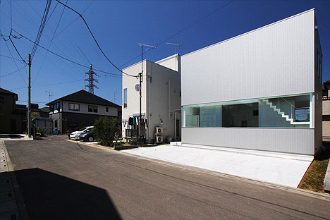
This house is called “Distance of Fog” and it is situated in the suburbs of Tokyo.
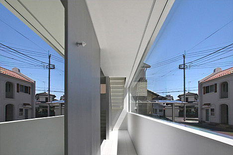
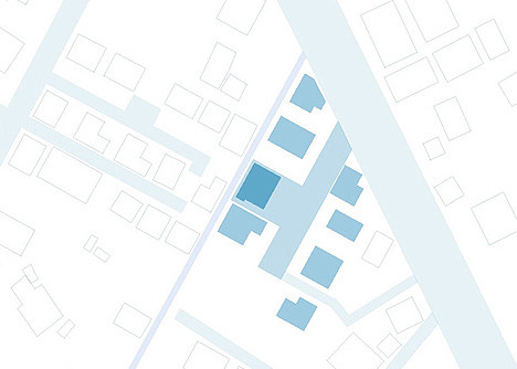
The project site is located on a cul de sac with seven other single family homes.
Cul de sac’s in Japan often are used as a common space for the families that live on them, and they are often used as children’s playgrounds or places of gathering.
But unfortunately, most suburban Japanese homes tend to be disconnected to the street.
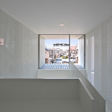
This subdivision is certainly no exception.
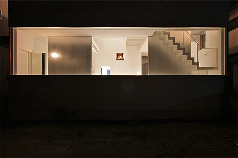
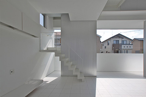
The client requested an “expanse of space” and an “open floorplan” which suited their lifestyle.
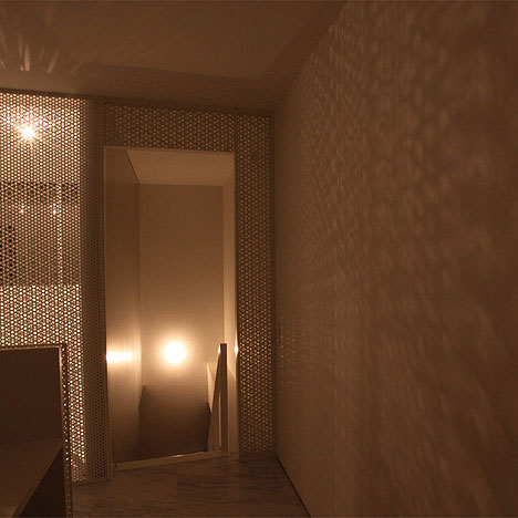
Therefore, we decided to design a house with a bright presence.
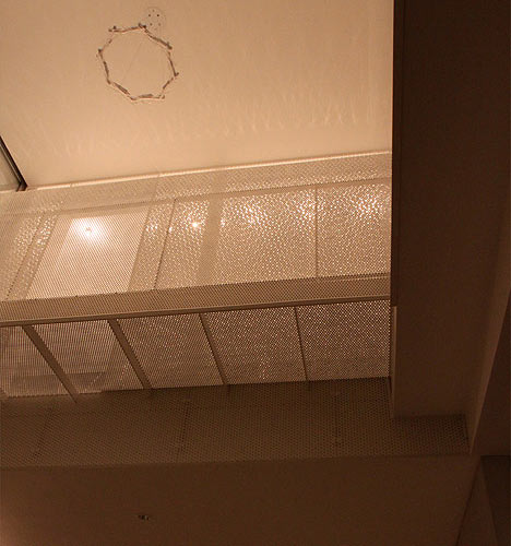
We also wanted to extend the brightness into the rooms and naturally illuminate the common spaces within the home.
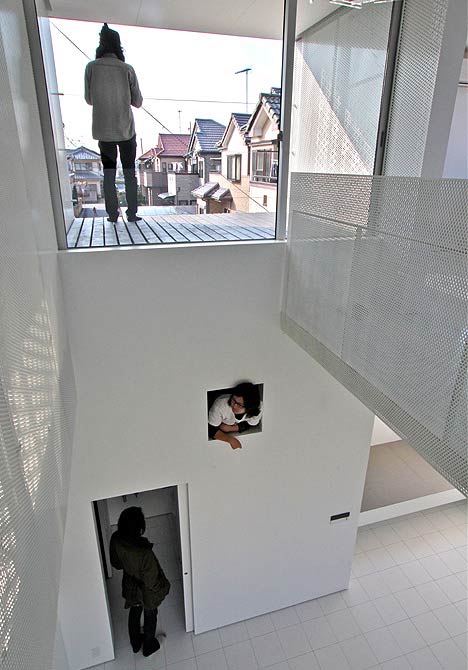
Privacy became the biggest challenge when deciding to open the home up to the street.
It became apparent that the proximity of the home to the road presented a challenge of separation between spaces.
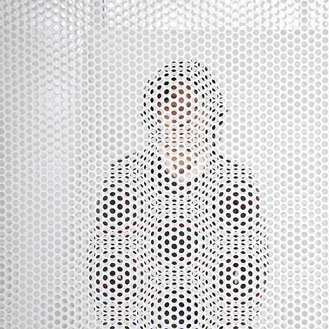
So we decided to create a sense of distance with the concept of looking through fog.
This concept breaks up the visual range, without creating a solid barrier.
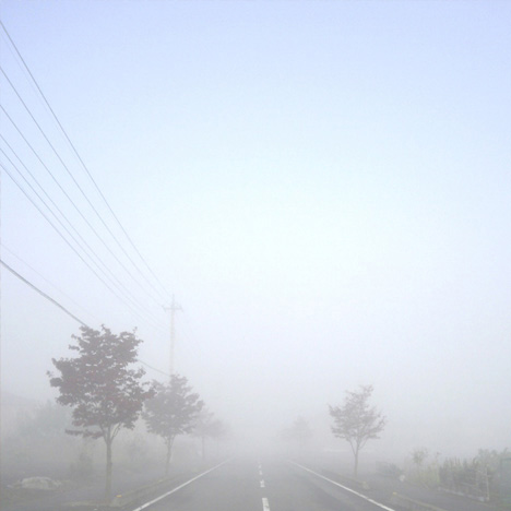
Using the concept of filtering an image, we adjusted the level of visual information penetrating through multiple layers, creating an effect similar to looking though fog.
First, we moved the house to the back of the lot and maximized the front yard.
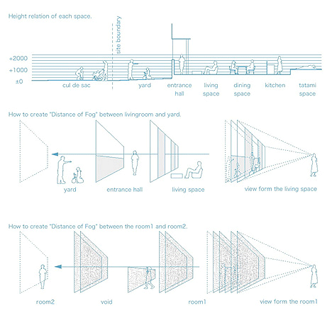
Then we adjusted the level of visual information as it relates to the finish floor level, placement of walls, and also reflections on mirrors and glass.
Furthermore, we separated the private room by using perforated metal screens, each one of a unique pattern, and they were arranged to very specific locations.
Tampa Covenant Church by Alfonso Architects
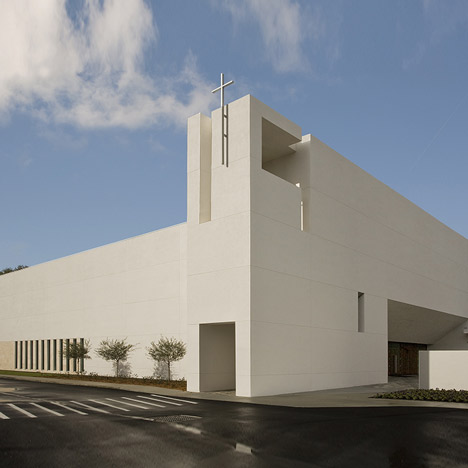
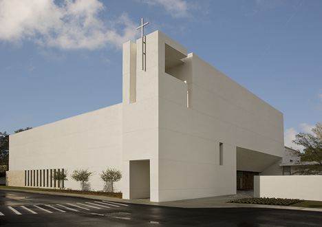
Alfonso Architects have designed a church in Tampa, Florida using the Fibonacci sequence to generate the proportions.
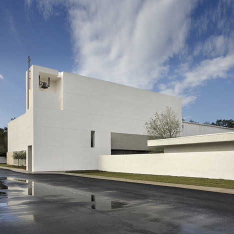
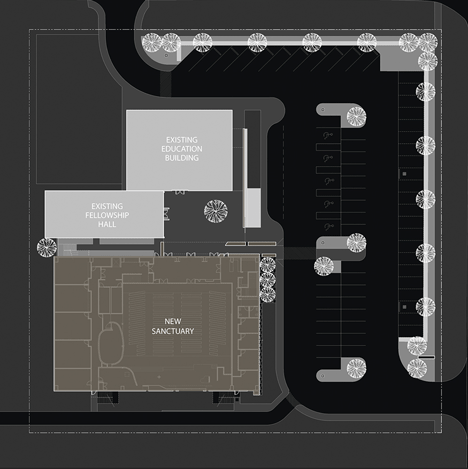
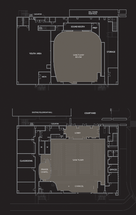
The Tampa Covenant Church features a newly built sanctuary, which is connected to two existing buildings that have been renovated.
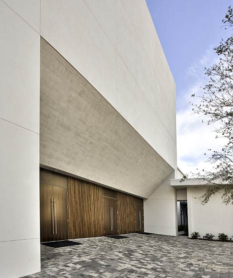
The three structures are linked by a new exterior courtyard.
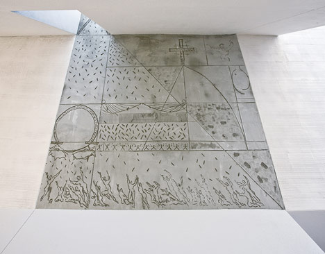
The church comprises a sanctuary, administrative offices and classrooms.
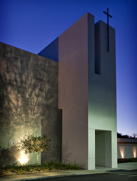
Photographs are by Al Hurley.
See Dezeen’s top ten churches.
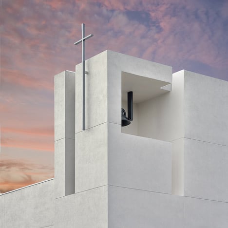
The following information is from the architects:
Tampa Covenant Church
Alfonso Architects
The program included a new 25,000 sf freestanding church building comprised of a worship sanctuary, administrative offices, and classrooms for an existing congregation of 450.
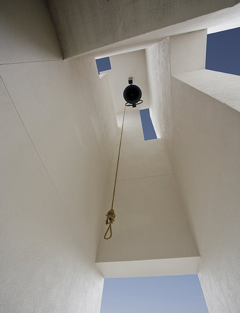
In addition, the project required the renovation of two existing single level buildings, one from the 1960’s and one from the 1990’s, and a complete site redesign including parking, lighting and landscaping.
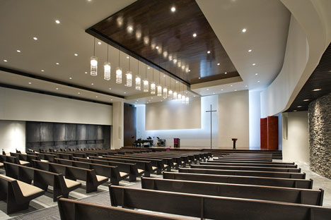
The challenge was to establish an intimate church campus by creating a new exterior courtyard as a catalyst for interaction as an exterior room joining the new and existing buildings.
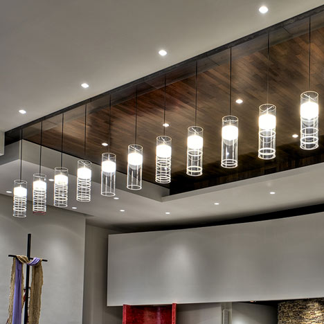
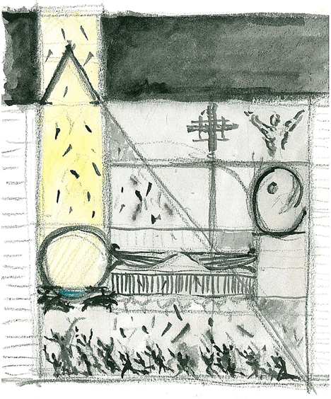
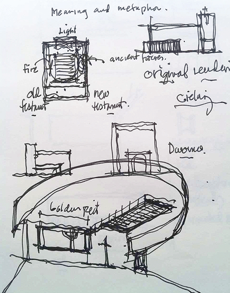
The project’s Interior and exterior were developed using the Fibonacci sequence to establish scale and proportion in tandem with the churches’ theological requirements.
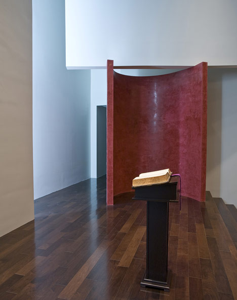
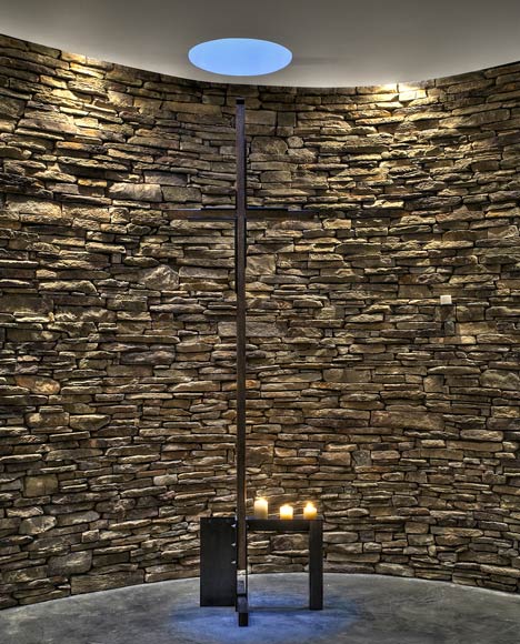
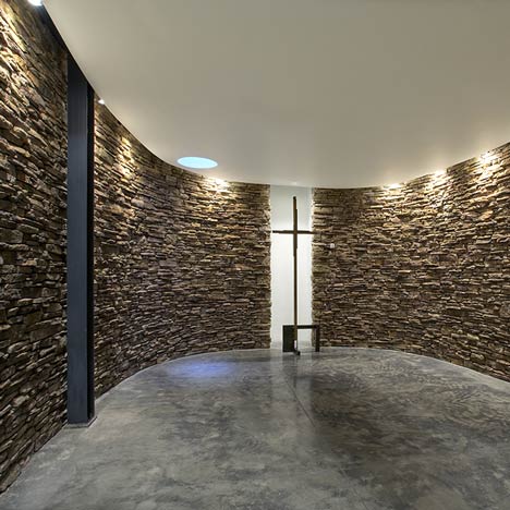
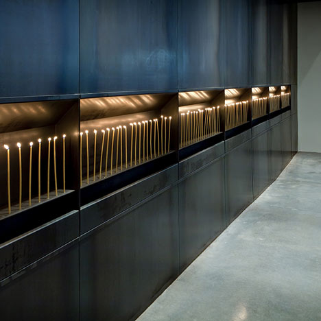
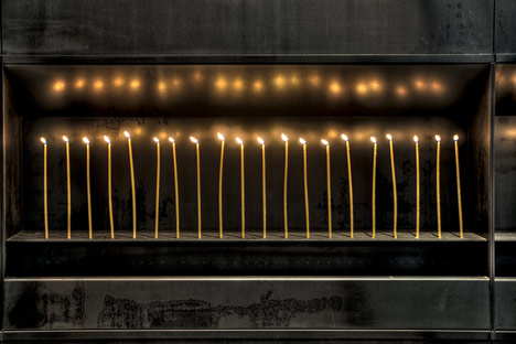
The many architectural features of the project were derived from theological precedence while reflecting quantities of numerical biblical importance (i.e. 3 olive trees, 7 candle boxes, 12 office windows, 14 pendant lights, etc).
Location of Project – Tampa, Florida-USA
Type of Project – Addition/Renovation
Design
Architect – Alfonso Architects: Alberto Alfonso – Lead Designer, Angel del Monte – Co-Designer
Inc
Year completed – 1/23/2010
Construction Manager - John Jazesf
Project area – 25,000 sf
Cost per Square Foot - $110
General Contractor – J.B.D Construction
Construction Cost - $2,600,000
Click for larger image
Click for larger image
Saturday, 2 April 2011
Pedestrian Crossing by Atelier 9.81
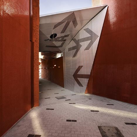
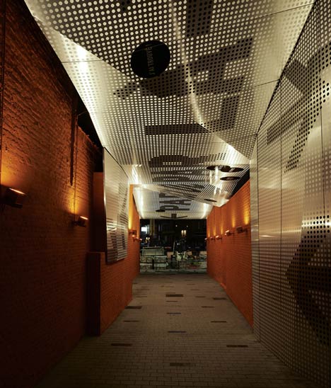
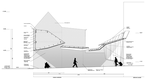
Atelier 9.81 of France have inserted a perforated canopy in between a row of houses to create a covered pedestrian walkway in Tourcoing, France.
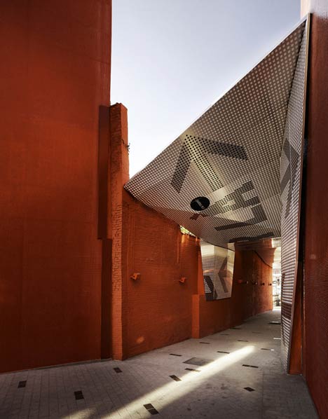
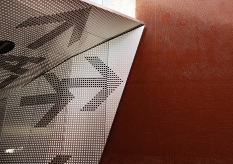
The structure is made from a composite of aluminium and plastic with a series of folds to create a roof over the passage.
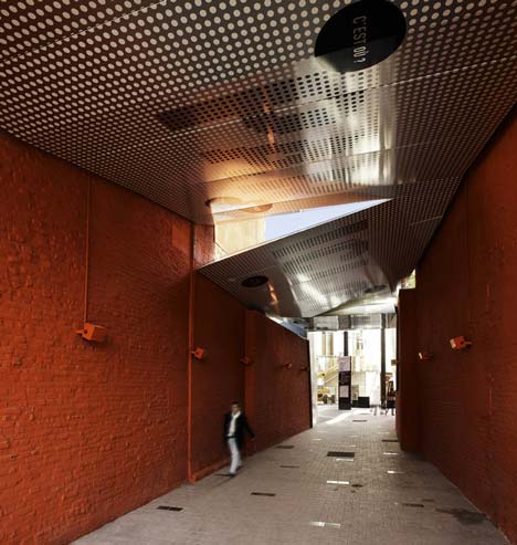
Graphics are applied to this surface, directing visitors between the new bus station on one side, and a tram and subway station on the other.
Photographs are copyright Julien Lanoo.
See more photography by Julien Lanoo in our special category.
The following information is from the architects:
Covered pedestrian crossing, downtown Tourcoing (fr)
Geoffrey Galand + Cédric Michel, associated architects
Atelier9.81
Atelier 9.81 of France have completed a bright red covered pedestrian walkway in Tourcoing, France.
Downtown Tourcoing is currently at the heart of an extensive restructuring, launched a few years ago. All public spaces, streets and squares are being fully renovated, and a large shopping mall with movie theatres will be inaugurated soon. As part of this project, the Metro, tram and bus station come together to offer a true multimodal system.

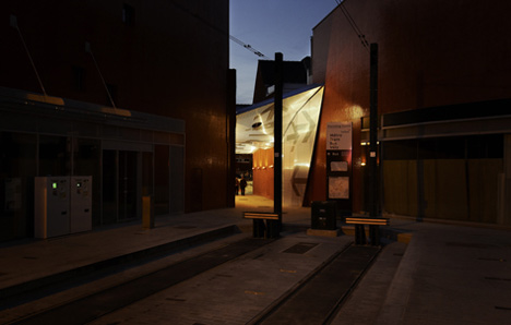
The project of a covered pedestrian crossing for downtown Tourcoing is born of this new direct relationship between transportation modes (with the bus station on one side and the trams and subway on of the other), between the Place du Doctor Roux and the Place Charles et Albert Roussel. The pedestrian crossing will fit into a row of townhouses of the same style, taking the place of one of them. By breaking thus with the alignment, the pedestrian crossing asserts itself visually, with the orange-red hues used on the open gables and by the constitution of a retro glassed facade, lit up at night.
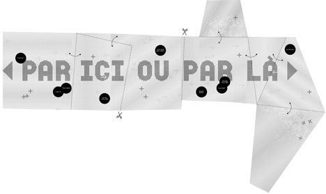
Stepping into the void thus constituted, the project consists in erecting a canopy representing an urban origami; Fine sheet of graphic Alucobond, a support for the signage designed with this project in mind. Spread out over a 20-meter-long, 4.5-meter-wide area, this sheet reveals numerous complex folds and height variations, from which it derives its uniqueness.

The covering ends in a notable slope, signalling the pedestrian crossing from the Tram terminus and the entrance to the shopping mall and Metro. The crossing’s floor is made of gray granite pavement, an extension of the planned layout for all downtown public spaces.
Click for larger image
Project management: Atelier 9.81 – urbanist architects, Geoffrey Galand + Cédric Michel – architects, Lucie Vandenbunder – project chief, IOSISgroup – BE generalist, Les Produits de l’Épicerie – graphic designers
Project owner: SEM Ville Renouvelée
Project Information: Covered pedestrian crossing between two public squares
Project surface: 150 M2 of covered crossing
Budget: 400,000 euros (excluding taxes)
Planning: Delivery in September 2010